
Color theory refers to the use of color palettes and color schemes as it applies to graphic design. This is something that’s very important when creating a website, a logo, or a creative, as it can make the difference between a design that’s pleasing on the eye and one that is almost physically painful to look at…
How Color Theory Works
Color theory essentially comes down to the color wheel which can be used to identify which colors will work well together and which won’t. Colors that are very different will often look pleasing on the eye, as can colors that are very similar. The problem is when you use the wrong color combinations, it can result in a slightly unsettling feeling that upsets the ‘harmony’ of your design.
Your objective then is to pick colors from the color wheel by following this principle. This gives you a few options for different types of color scheme:
Complimentary Color Palette

These are color schemes that use two opposite colors on the color wheel. An example is purple and yellow, or red and green. Complimentary color palettes can be quite striking, especially when the colors are used at full saturation, and are especially useful for when you want something to stand out. Just be careful not to overdo these vivid colors.
Triad Color Palette

This is a color palette that is formed of three equidistant colors on the color wheel. This gives you a few more options while ensuring they will be suitably contrasting still. Generally, you’ll want to choose one color to dominate and let the other two colors be accents.
Analogous Color Palette

This color palette uses two or three neighboring colors. One color is usually dominates, with the second color in a supporting role, and the third color used as an accent. Analogous color schemes are usually peaceful and calming.
Monochromatic Color Palette

Finally, this type of color palette uses just one color but in different brightnesses, shades and depths.
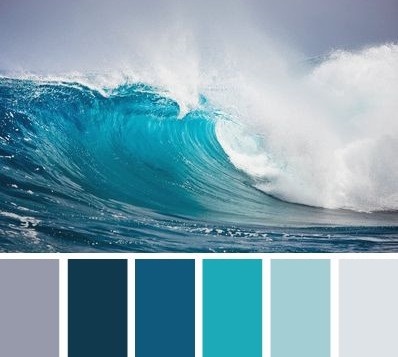
Nature’s Color Palettes
You can also create a color palette by looking at an image from nature that you like and then using the color picker tool in your graphics program in order to select specific colors you like from that image.

Naturally occurring colors always work well together and this is likely where we get our innate sense of color harmony from.
Color Psychology
Finally, note that colors can have different impacts on our emotional state and psychology. The color green for instance is relaxing and has been shown to aid creativity. The same is said for blue and websites that want to reduce bounce rates (where people leave the site quickly) use a lot of blues for this reason. Red on the other hand has actually been shown to increase the heartrate and as such if you make a ‘buy now’ button red, then you will automatically get more clicks simply because people will act more impulsively.
Want to create your own color palettes? Try Paletton!

